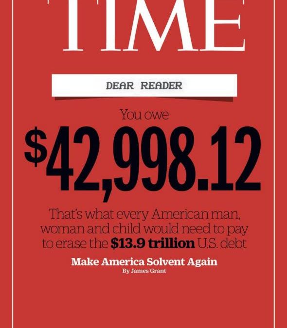
Magazine Covers That Succinctly Communicate The Whole Story
 I have read Time Magazine on and off since 1982 or maybe earlier, but it had its biggest impact when I was 7 years old. Two issues from that period of time stick in my mind – one featured Michael Jackson, who was just about to release Thriller; and the other one had George Lucas and some exclusive photos talking about Return Of The Jedi, and it also had Neverending Story in there as well. The media unpacked stories on a lot longer timeline at that point, there wasn’t even a married up cinematic release like there is now – you had to wait for new films, and the wait for news could be just as long. It was easier to create and keep a sense of mystery about films, and anything else really.
On-set photos were a rare thing, and I wasn’t old enough to buy film magazines, in the unlikely event our village shop would actually stock them; so unlike the media saturated environment I now live in, back then you’d starve for and then clamp onto the knowledge that came your way.
Cut to now and the media environment has changed drastically – there are several ways that stories reach you, and working on your signal to noise ratio, you are often involved in a battle between processing as much as you can while determining the veracity of the source (I am sure this is not a problem unique to me). So as this data moves in and swamps you, for a story to stand out and actually grab your attention – for a magazine cover to recall for you the visceral impact of some of those photojournalist pieces when magazines and newspapers were still the medium du jour … well, that is something special.
Design Isn’t Window Dressing – It Can Communicate Even More
Time Magazine have been knocking it out of the park recently in terms of their front cover design, but funnily enough, with the odd symmetry of a thing that hits you right in the solar plexus with its wowness, two covers recently slammed into me pretty hard. One because it was addressed directly to me – the other because as soon as I took it out of my mailbox it communicated to me in a very instant and emotional way.
The first one was very cool – they had made it so that every single one of their subscribers got a cover telling them their portion of the national debt, personalized with their name. Who is used to seeing their name on the cover of Time Magazine? Not me. It was a very simple way to drive home how much the national debt is and to communicate your own responsibility in that.
The second cover was a black background with the names of the Orlando Shooting victims on it. Again, super simple, and it took me no time at all to realize what it was. It had a similar effect: giving me the instant sense of how many people had died, something I strangely hadn’t thought about – statistics can be rattled off, but names take a little longer to process.
This is how everyone should want to communicate to their audience – instantly and with impact; you can unpack all the significance later, but if you gut punch someone like those two magazine covers did with me, you already have the person hooked, and you have earned the time that they are going to spend listening to the rest of what you have to say.
Sure, you have to have the substance to back up the fireworks – but if you don’t have the fireworks to draw in the attention, who is even going to care what you have to say? Time Magazine, in these two issues at least, has been bringing both.

