
Starbucks’ Advertising Is Still Piping Hot In 2016
I’m late to this party, but can we please talk about this for a second? This advertising from Starbucks is…well…brave. Watch this video posted around a month ago, from Starbucks’ official YouTube channel:
Now, for the unenlightened, or anyone who doesn’t bother to know about strange P.R. kerfuffles from coffee shops, last year Starbucks deemed to remove any Christmas-related symbols from their cups. Leaving nothing to make it specific to a holiday—though keeping in the red and green color. And a lot of people, or at least the internet and media made it seem like a lot of people, got rather up in arms about the whole thing. Wrapping the incident into the “war on Christmas” party which also rears its ugly head around now.
And, I don’t personally have an issue one way or the other with it. They are a private company, and I don’t go and drink coffee at the Starbucks on Cleveland Street or anywhere else often enough to have a strong opinion. But, I will say using that controversy now as advertising, is darn clever. The ad may as well say: “come at me”.
And controversial publicity is often good publicity, so I can only imagine how it played out for them—and how much money they made. But, in a move also calculated to perfection, they added this advertisement to hit the critical mass of effective advertising.
Watching this made the inside of my head go “boom.” This is practically a mike drop of ingenuity. They hit all the bases. They involved the customers and thus made the P.R. for the company even stronger. They created—like the gingerbread latté—an artificial scarcity specific to the holidays. They brought attention down on them to make the blow hit as hard as they could to the right eyes. And did it with flair.
A Delicious Blend Of Advertising Tactics
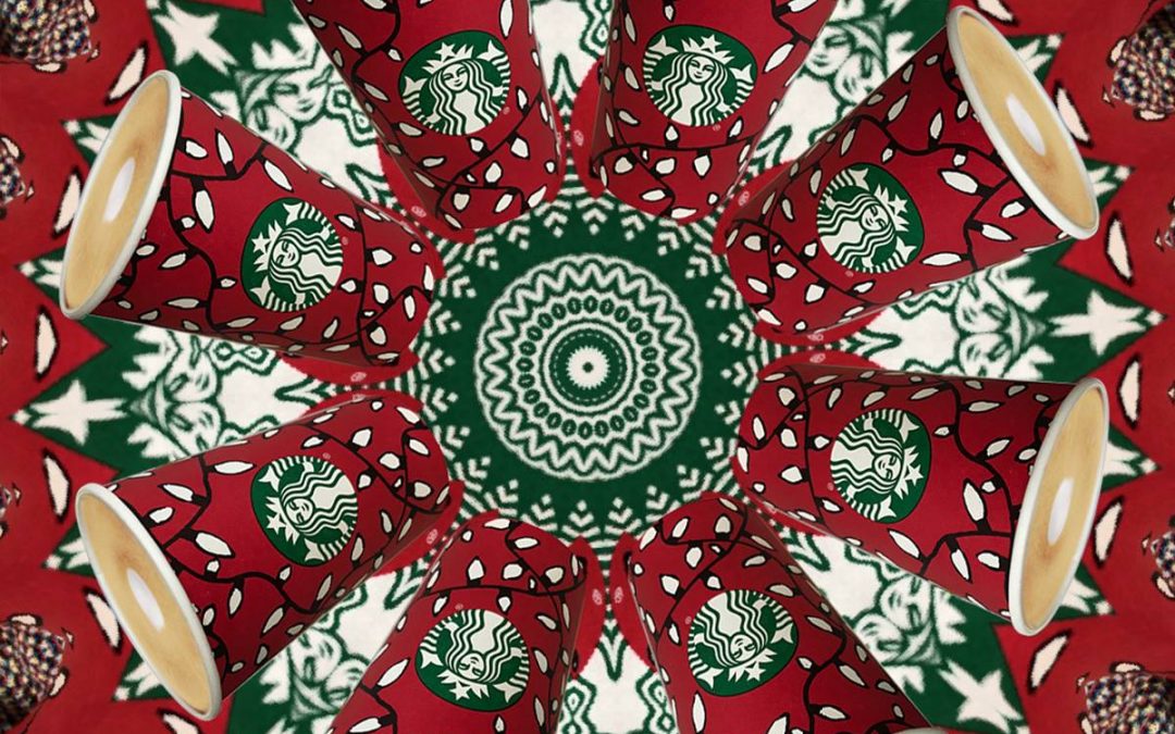
Because I hope I am not alone in saying that those cup designs are beautiful. They are stylish and sync up well with the general esthetic of the brand. That of minimalism, but friendliness. The same simplistic setup which Apple and Google and Facebook and Best Buy all use to great success.
And, if you look over the designs, they are apparently cool with bringing back the Christmas iconography again. Which, funny enough, might make (or likely already made) a whole different group mad. But, that’s neither here nor there for our immediate purposes. And all I can say is, regardless of how you might feel about it, and what this may or may not represent, you must at least give some props for them doing something with so much gumption, and being confident enough to take a stand, and to do so in a way that no matter how many people it may make mad, they will still probably rise above and succeed.
Also, the fact the previous sentence, taken out of context, could be construed as talking about President Elect Trump is not lost on me. But hey, whether for delicious drinks or the political parties: good advertising is good advertising.
If you liked this article, you can read more of Brandon Scott’s work on The Hive, or at his website: www.coolerbs.com